ISB Merlin 4000


Context
Redesigning the Merlin press brake system with a touch interface, automation, and real-time feedback will boost efficiency, reduce errors, and enhance safety.
Role
UXUI Designer
Timeline
3 Months
Core Features
Automated Learning
7” multilingual display with intuitive controls for faster onboarding and training.
Automated Learning
Dynamic adjustment of safety parameters reduces manual input and user errors.
Seamless Data Management
USB backup and near-unlimited job storage improve user control and efficiency.
Development Process
Research
While I conducted primary and secondary research, engineering assessed the device’s limitations. Since this was a full overhaul of the Merlin 3000, understanding our capabilities was crucial.
Synthesis
After identifying client concerns through research, I presented my findings to stakeholders, highlighting the most critical updates for the Merlin 4000.
Conceplization
I created mockups and user flows while engineering finalized the device resolution and other specifications.
Development
Once both the design and engineering teams approved the designs, we developed a prototype for real-world testing in a controlled environment. The testing process was intensive and required travel to various sites.
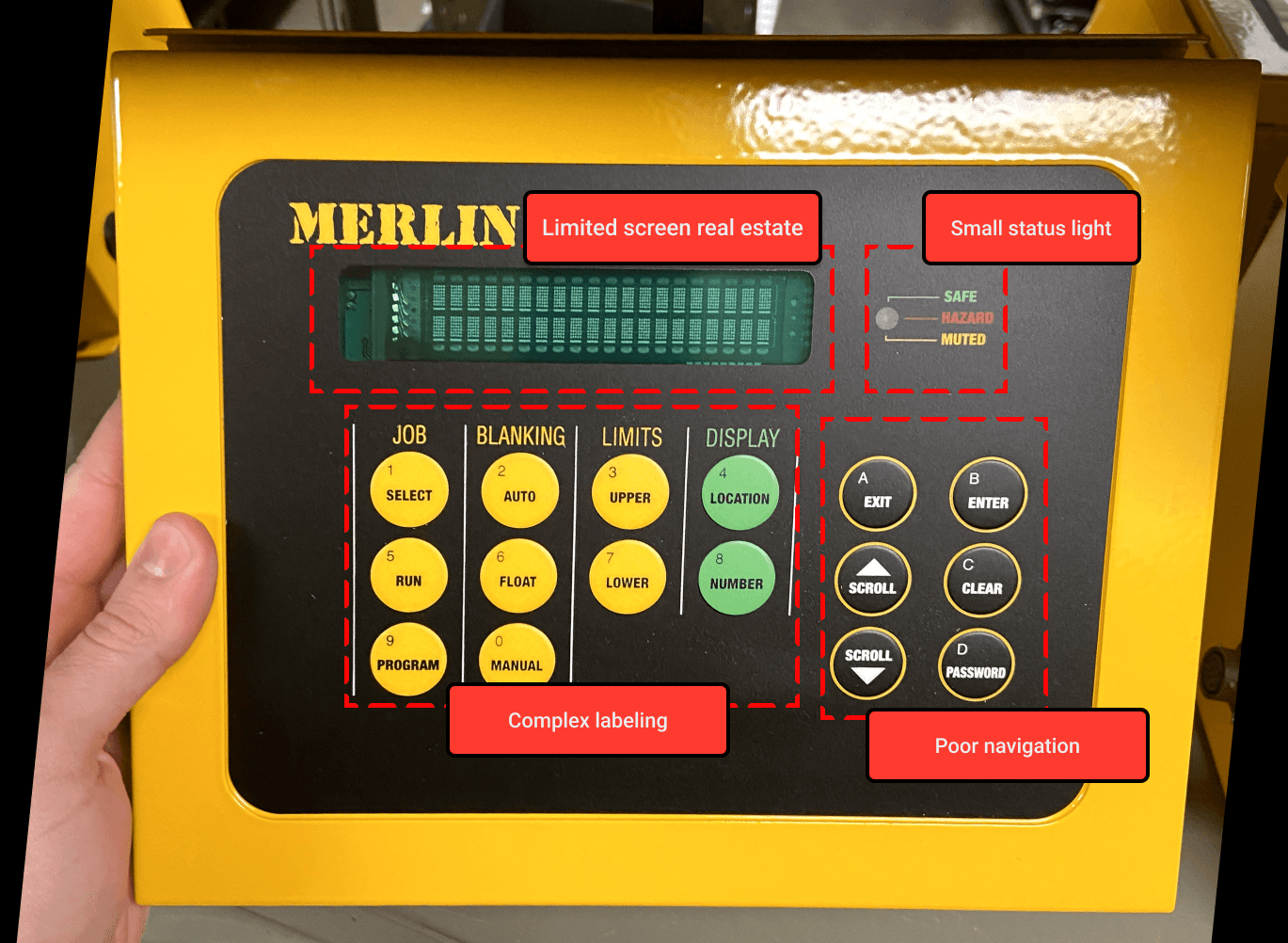
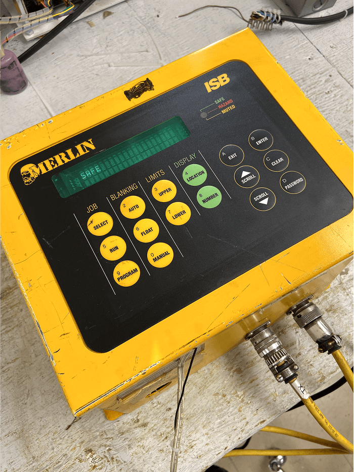
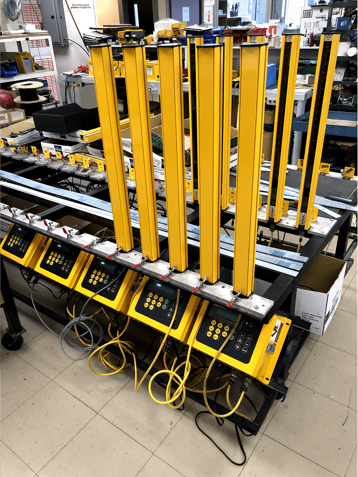
Identifying problems with the Merlin 3000
The Merlin 3000 press brake guarding system has issues with error messages like 'Hazard' and 'No Column,' causing safety concerns. Older press brakes also require custom modifications for proper integration and compliance.
Findings from Primary Research
I conducted quick interview via phone calls to the sites directly and speak with facility managers. I wanted to first get a quick grasp on how they operate on a day to day basis. While doing this, the engineering team visited a few sites to see how they set up their systems directly. We took on the sites that were highly interested in updating their systems.
Main Feedback
Outdated Interfaces
Basic displays with limited interactivity, making navigation less intuitive.
Complex Interface Navigation
Older models used non-touch, button-based HMIs, making navigation cumbersome and increasing user errors. This led to longer learning curves, extended onboarding, and trust issues with the system.
Manual Adjustments
Users needed to manually configure safety settings, increasing cognitive load.
Limited Data Access
No easy backup or job storage, leading to inefficient workflows.
Statistics and Secondary Research
We started with in-depth secondary research using the data from our Pendo and drawing hypotheses and insights on what needs to be worked on exactly.
30%
User Satisfaction
57%
Profile Errors
24min
Average Time Spent
Ideation - Development of Ideas
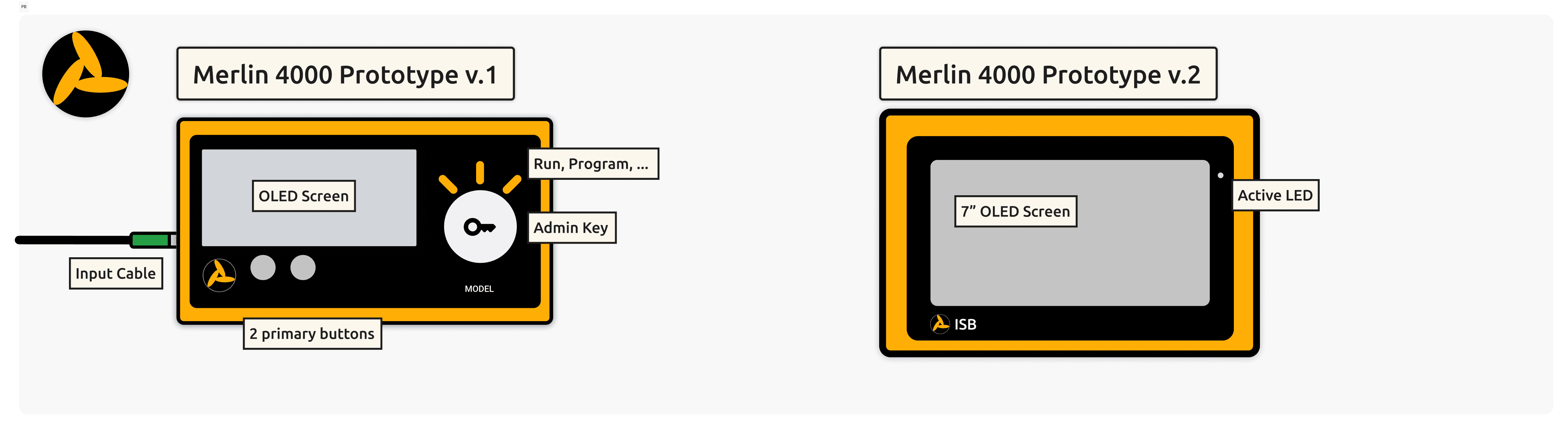
In Phase 1 of ideation, engineering debated between a fully touchscreen interface or a hybrid with buttons and a key lock switch. Ultimately, the Merlin 4000 v2 moved forward with a full commitment to a 7-inch touchscreen, eliminating all physical buttons.
Low-Fi Mockup
After extensive discussions with the team to identify key themes and align stakeholders on the direction, we began with low-fidelity mockups to establish a clear vision for the design approach.
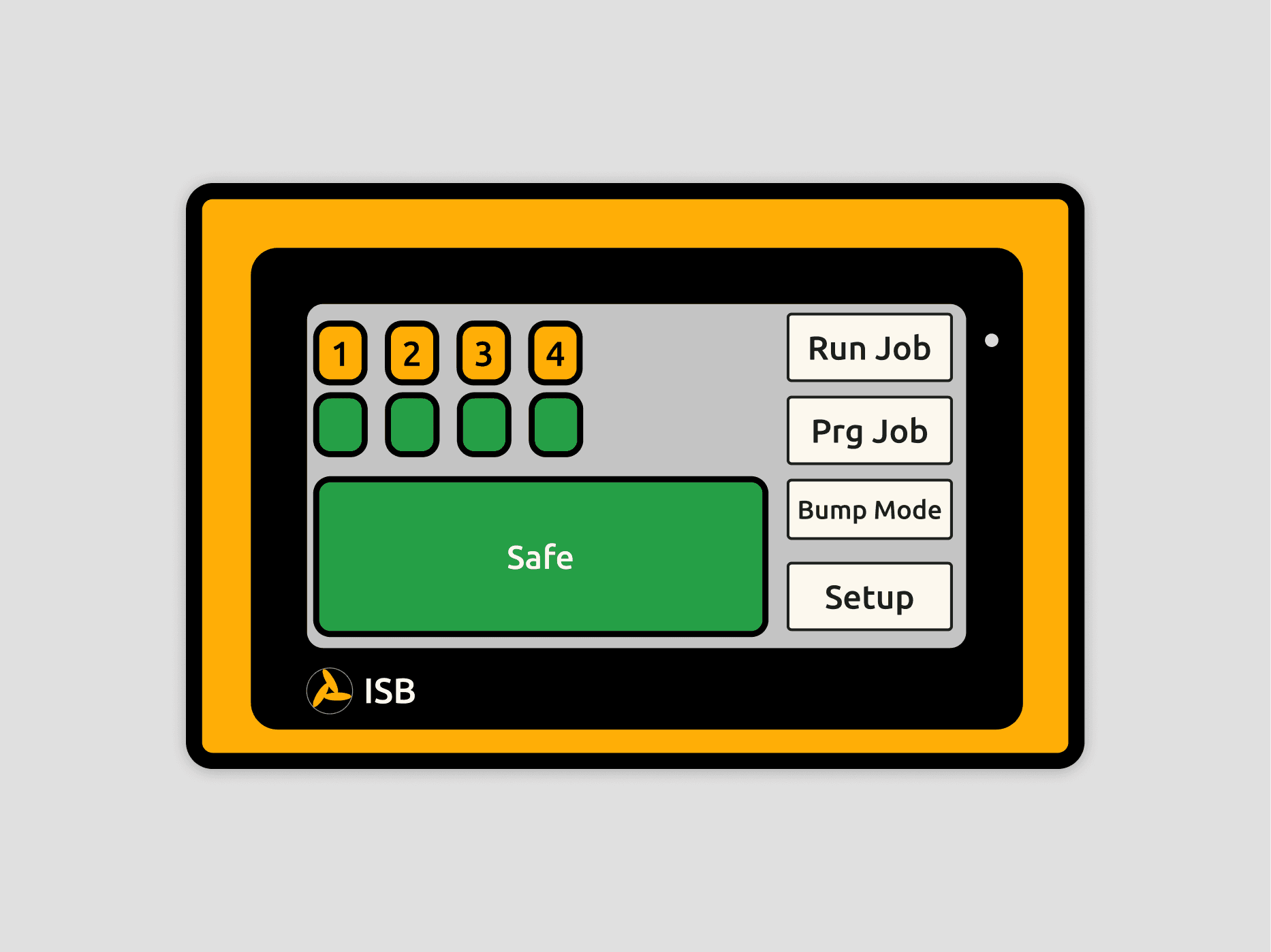
Hi-Fi mockup
After finalizing low-fidelity designs with the product manager, I introduced larger configuration profile buttons with icons for easy identification. Simplicity and accessibility were key, especially for emergencies, while maintaining design continuity remained a top priority.
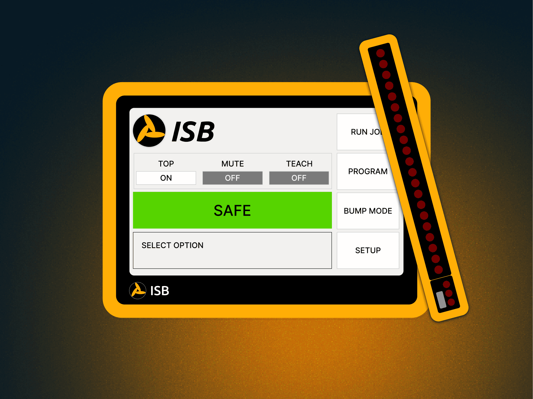
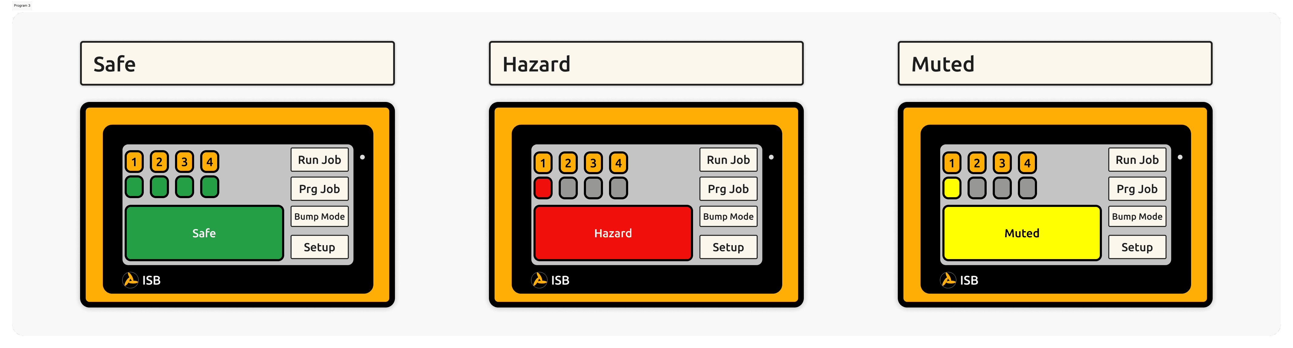
Safety Status Alert UI
Enter here
Validating the designs
why did we make these design decisions
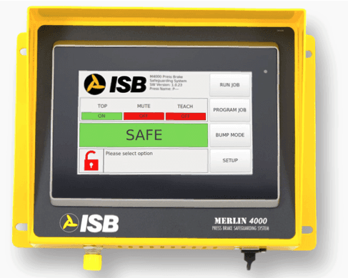
UI Choice
Large and accessible UI to showcase what mode the Merlin is and if it safe for operation
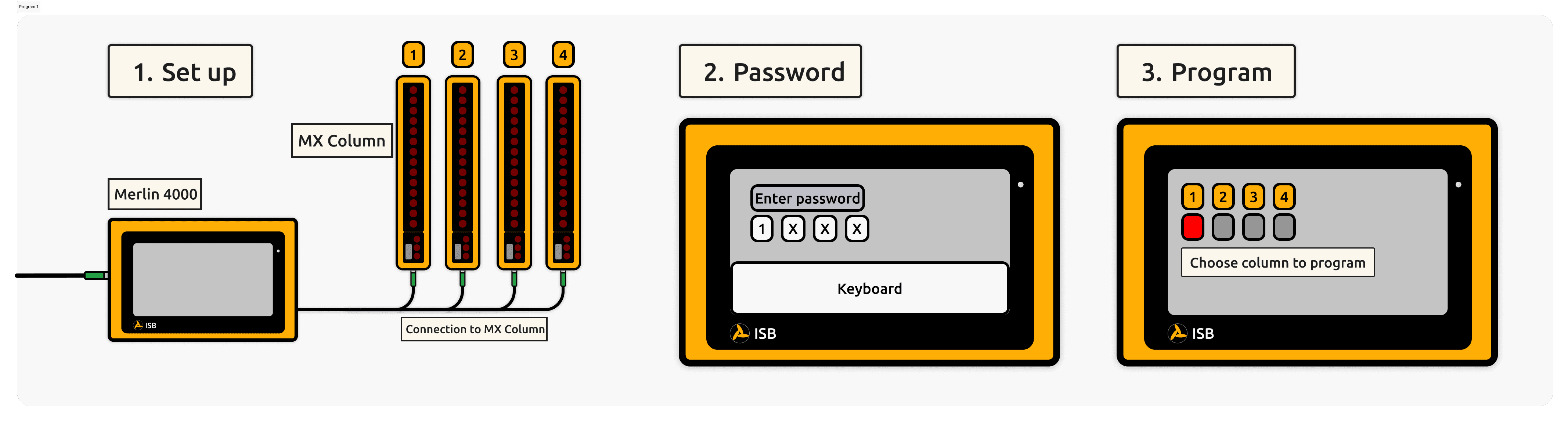
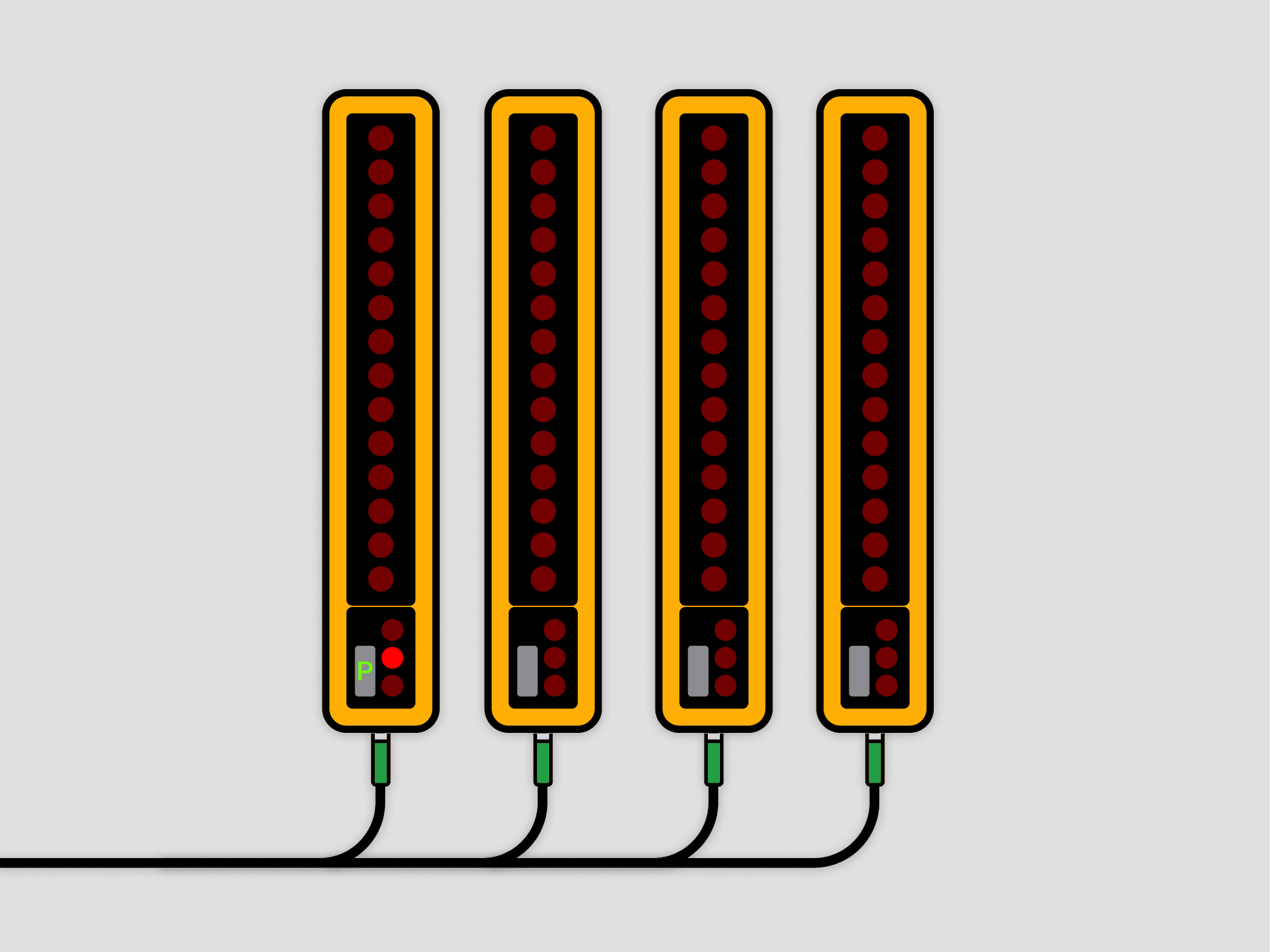
Program P indicator on MX columns
The MX columns will have a small screen to indicate what mode it is in. A simple P is enough for a worker to see what mode the MX column is in and that it is no operationtional untill the P and the Red LED is switched off
“Alerts are clearer, and I’m less likely to miss critical warnings during high-pressure situations.”
-Annonymous User
"I like the fact that both the MX columns and the Merlin work well together. Sometimes, I'm not near the Merlin, but I can see the situation on the MX columns as well. That's a huge bonus for me.”
-Annonymous User
Final Results
Post-launch, I gathered data through client surveys, usage analytics, and error logs. Metrics showed increased upgrades to the Merlin 4000, fewer programming errors, and reduced training time due to improved navigation.
76%
Clients would Switch to Merlin 4000
89%
Fewer Programming Errors
22min
Drop in Training Time
Reflections
Unique UXUI Experience
This project was unique as it blended HMI design with digital UX/UI, ensuring seamless interaction between physical controls and a modern touch interface. It prioritized efficiency, safety, and usability while meeting industrial and ergonomic standards.
Collaboration
Collaboration with engineering was crucial to ensure the design aligned with hardware capabilities, safety standards, and real-world constraints. Their input helped refine feasibility, optimize performance, and integrate UX/UI seamlessly with the physical system.
Think Outside the Box
Thinking outside the box was essential to reimagining the user experience beyond traditional HMI design. By challenging standard interfaces, we introduced a more intuitive touch-based system, streamlined workflows, and reduced errors. This approach allowed us to push past limitations and create a more efficient, user-friendly solution.